Monitor your service
Dashboard Hierarchy
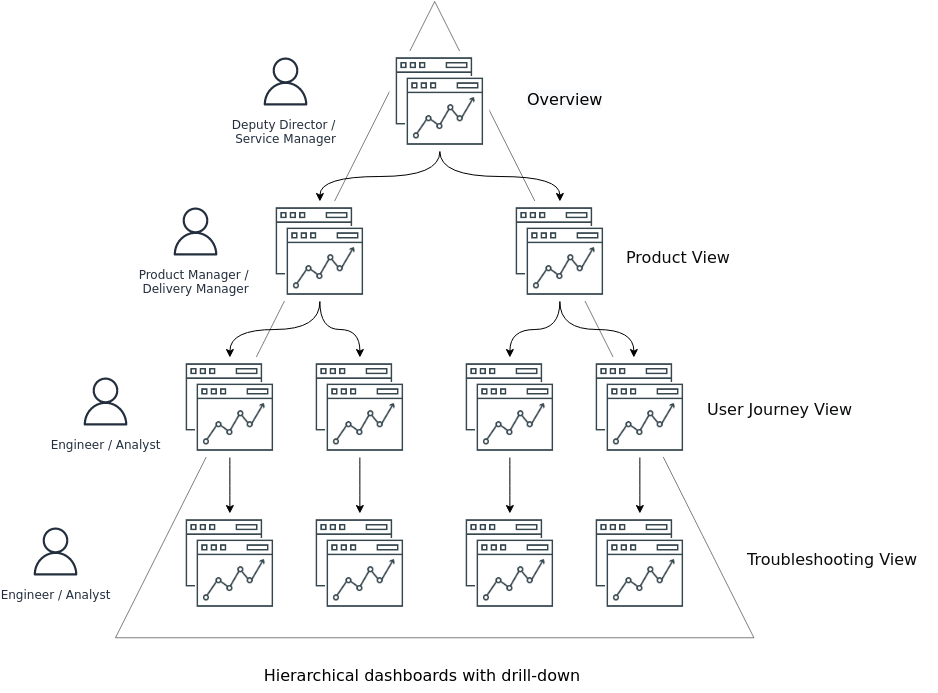
Following the design principle of "Hierarchical dashboards with drill-downs to the next level" 1, we have developed a five tier dashboard structure to fulfil different persona needs as follows: -
| Dashboard | Description | Persona / User | Dashboard Title |
|---|---|---|---|
| Overview | Observability of all products and tenants running on a platform. | Service Manager | SRE MaC / Overview |
| Product View | Observability of all the user journeys running on an individual product. | Product Manager and Team | SRE MaC / {Product Name} |
| User Journey View | Observability of all the SLIs in a single user journey. | Engineers / Analyst | SRE MaC / {Product Name} / {User Journey Name} |
| Detail View | Observability of all whitebox and blackbox metrics which contribute to SLIs and Service Health. For troubleshooting. | Engineers / Analyst | SRE MaC / {Product Name} / {User Journey Name} / Detail |
Dashboard Design Principles
1.0 Methodology
| ID | Principles |
|---|---|
| 1.1 | Methodical dashboards according to DDaT SLI/SLO standards. |
| - Dashboards focused on symptoms rather than causes. | |
| - The ability to visualise adherence to SLOs in a dashboard | |
| - The ability to visualise Error budget in a dashboard | |
| - The ability to visualise Burn Rate in a dashboard | |
| 1.2 | Align SLI/SLO dashboards to standard Google SLI Categories |
2.0 Automation
| ID | Principles |
|---|---|
| 2.1 | Scripting libraries to generate dashboards, ensure consistency in pattern and style. |
| - No editing in the browser. Dashboard viewers change views with variables. | |
| 2.2 | Version controlled dashboards iterated inline with code management best practices |
| 2.3 | Reuse dashboards and enforce consistency by using templates and variables. |
| 2.4 | Dashboards should be linked to by alerts. |
3.0 Visualisation
| ID | Principles |
|---|---|
| 3.1 | Keep graphs simple and focused on answering one question |
| 3.2 | Dashboards should reduce cognitive load and be quick to figure out |
| 3.3 | Expressive charts with meaningful use of colour and normalising axes where you can. |
| - Example of meaningful colour: Green/Blue means it’s good, red means it’s bad. | |
| - Example of normalising axes: When comparing CPU usage, measure by percentage rather than raw number. | |
| 3.4 | Use a meaningful name |
| 3.5 | Browsing should be directed with links. |
| 3.6 | Add documentation to dashboards and panels |